To add these kind of badges, we’re gonna use some html. Go to Dashboard > Appearance > Menus and select the Primary Menu.
Here is the structure of an item: i (icon) + span (label) + ins (badge)

Exemple:
<i class=”cera-icon text-primary cera-file”></i> <span>Pages</span> <ins class=”bg-success”>New</ins>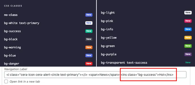
The html tag has to have a CSS classes to attribute the color. By default, it is the primary color who is used. Note that the label have to be in a span tag to make the badge align to the right.
Here are some exemples ready to use:
<ins>New</ins> = New<ins class=”bg-red”>New</ins> = New
<ins class=”bg-green”>New</ins> = New
<ins class=”bg-success”>New</ins> = New
Going Further
How to Edit Colors and Icon in a Menu
Some CSS classes allow you to change the background colors of the icons used in a menu. Each of them uses a color set in the customizer.
What icons can I use for my menu and on the whole site
A large choice of icons is available for your theme. Depending on the theme you choose, several icon packs may be available.
How to edit the text in a menu?
The text in some sections will not be editable in the classic page builder. The reason is that they are in a menu displayed thanks to Grimlock Menu block.


